
Yippee, 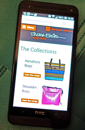 at long last we’ve got our act together and our website is now mobile friendly.
All designs can be viewed, one at a time, in the different categories. Just click on the category you want to see and scroll down through all the products. Everything is listed (as on our desktop site) in price order with the least expensive items at the top and the higher prices below.
A click on the View Details button on any product opens up more photos and a full description of each design with details such as measurements and the weight of the item (for travel luggage).
If you’re reading this on a mobile device, click here to see our new site now.
I hope you like it and if you’re a mobile shopper I’d love to hear your comments after you’ve taken a look. Please comment here in the comments section below this post.
Thanks 🙂
Shona
