Since I started designing my own label in 2001 I’ve had various branding for ‘e’ or Easton. I wonder if anyone ever noticed the more subtle ones?
Jeans style stitch
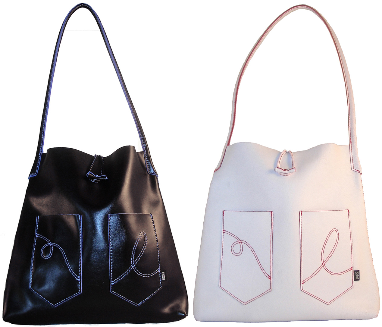
These bags were from my second ‘Velo’ collection in the early 2000’s. As the simple shaped bag design had 2 pockets on the front, I wanted to add a stitch detail like you see on jeans pockets. Inspired by Levis, Wrangler, et al, I designed my own embroidered double stitched loop on the left hand pocket moving over to an ‘e’ on the right hand one.
Quilting
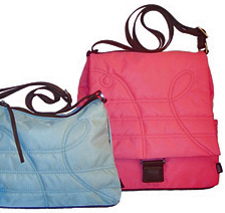 A couple of years later on, I fell in love with a million colours in a fabulous satin feel nylon material but as it wasn’t thick like leather, I decided to quilt it and came up with a new design using my loop and ‘e’ in the quilting stitch.
I named this collection ‘Polar’ as the bags looked like warm, cosy quilted jackets you might need on a polar expedition. The vibrant outer colours also had super bright contrast linings, making many owners wish their bags were reversible!
Suede and Simple
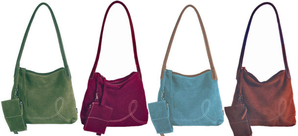
Another idea came to me when I found some gorgeous super soft suede leathers in fabulous muted colours. 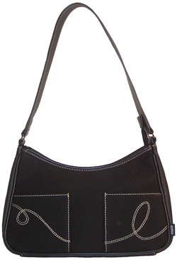 This time I let the leather do the talking and simplified my loop and ‘e’ to just the ‘e’.
Tokyo Jeans
I used to travel a lot with companies I’ve previously worked for and Tokyo was one of my favourite shopping destinations.
Very often, Japanese design is super simple looking, understated but beautiful, so when I found an Italian waterproof canvas in a clean black twill, I decided to re-visit my jeans stitch design and I called the collection ‘Tokyo’.
E is for Easton
![]()
On all the designs shown above, there’s also a mini ‘easton’ label – also inspired by the ones you see sewn into the side of jeans pockets.
I still use this label to this day, although I’m thinking I should make it a brighter, stand out colour, rather than black. That said, most bags are bright colours, so maybe the black does stand out after all?
E is also for…
Ellie, a new design. Here’s my favourite, the mango one. I like it best because of it’s blue and white spotty lining.
Eels! The Eel Catcher’s Daughter, one of my stockists. This gorgeous gift shop in Ely, Cambridgeshire, is well worth a visit if you are in the area. Say hi to Helen and co, from me when you go there 🙂
What do you think of my ‘e’s for Easton? Are they too subtle, or is that how you like it? I’d love to hear what you think.

How lovely to see how your logo on the bags has progressed over the years. I love how subtle it is and doesn’t overwhelm the bag’s overall design
Oh, thank you Sarah. I was wondering if anyone had even realised that my ‘e’ stitch was an ‘e’ for Easton. Maybe it doesn’t actually matter! I definitely don’t want it to overwhelm the overall design.
This is fascinating. Your work is so concrete (and yet soft) I loved seeing how your brand/logo has developed.There is something so understated about your e label – personally don’t like huge flash logo’s
Thanks for your comments & feedback, Helen. I like to hear people’s opinions 🙂
I love the “e” stitching. I like that it is simple, not loud and gaudy! I wouldn’t change it all. Looks awesome!
Thank you Julie. That’s great feedback.
I’m loving these suede tones! Reading your blog is like getting a fix of bag porn everyday!
🙂
As I’m not a bag man, I felt unable to make a reasonable comment, however Miss Gardner who knows a thing or two about bags and dare i say shoes 😉 likes the simplicity of the letter ‘e’ logo. She also likes the full use of your name in the small logo, as she put it “small enough not to shout at anyone, but big enough to know it’s there”
Thanks for getting another opinion for me Mike!